Create a Restful Bedroom, Cozy Den, or Calm Office Space with the Principles of Colour Psychology...
Though one might imagine that his or her interior decorating choices are determined solely by function and surface-level aesthetic preference, many design decisions are actually deeply rooted in psychology. Our past personal, cultural, and evolutionary experiences contribute heavily to the way people assign meaning to shapes, textures, and colours. For instance, while the majority of people prefer blue in their homes, one person might link the colour to an unpleasant personal experience. Furthermore, as Dr. Sally Augustin explains in her article “Go with Green” for Psychology Today, culturally we have come to associate vibrant greens with “nature, renewal and acting in an environmentally responsible way.”
Lastly, Dr. R. Douglas Fields notes in his article “Why We Prefer Certain Colors,” that some colour preferences may be evolutionary; humans may have learned over millennia to associate blues “with a clear sky and clean water” and to “be repulsed by colors associated with” harmful or negative situations. Regardless of its origin, colour psychology (which is key to countless design philosophies from Feng Shui and Zen to Hygge) can be harnessed to create the desired mood or encourage a specific result.
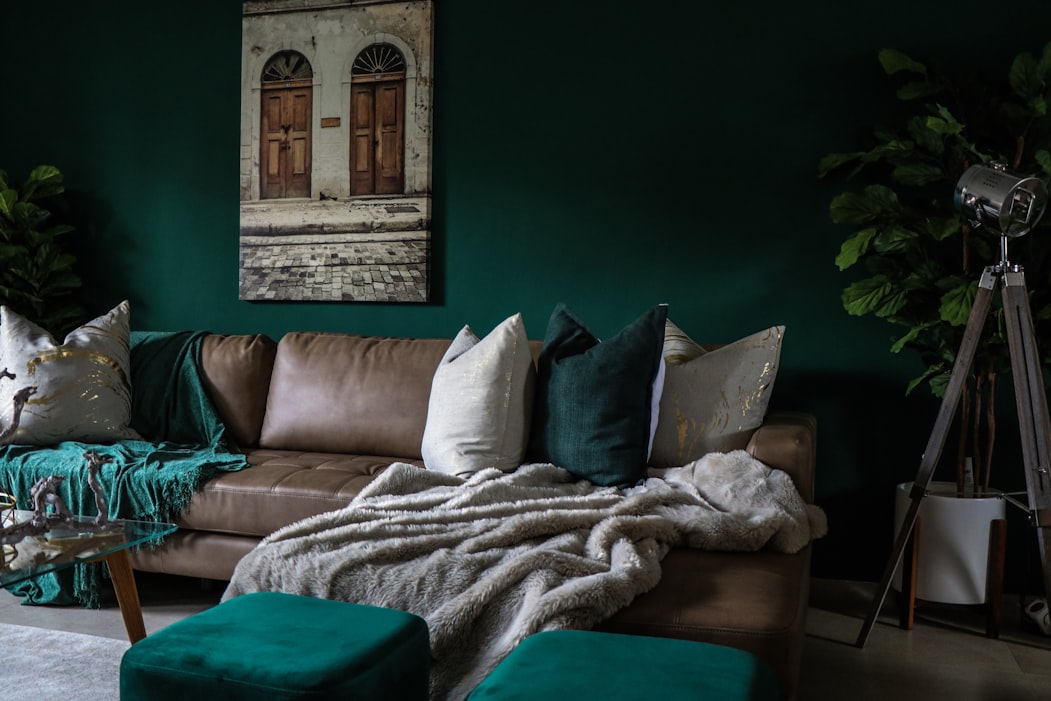
Cool Tones

Greens, blues, and cooler purples can be either relaxing or stimulating, depending on the shade and opacity chosen, but are typically associated with calm and quiet, making them well-suited to bedrooms, reading nooks, and meditation spaces. They are considered best for non-social environments because they encourage self-reflection and discourage extroverted activity. Cool colours like green and blue are considered ideal for many spaces because they inspire feelings of tranquility and optimism, while their connections to the natural world have a centering effect.
However, as explained by colour specialist Kathryn Lloyd of Crown Decorating, “personality type can determine how a person responds...Some may find warm colours overpowering while others may find cool colours cold and unappealing.”
Warm Tones
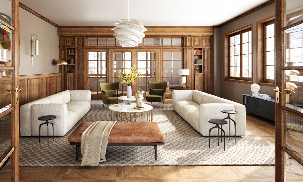
Warm tones (yellows, reds, pinks, oranges, and most browns) are generally recommended for gathering spaces because they are thought to evoke feelings of closeness and camaraderie. However, warm colours must be chosen carefully because they each awaken different emotions; bright orange is known to be energizing, making people feel excited, confident, and comfortable all at the same time. On the other hand, light pinks often evoke a more muted emotional response, one of gentle contentment.
They can also make a room feel physically warmer, making warm tones ideal for chilly or drafty areas of a house. While perfect for social spaces, Kathryn Lloyd warns that warm tones are not recommended for home offices, libraries, or other places requiring focus or concentration because they “have been known to increase rapid eye movement and blood pressure.”
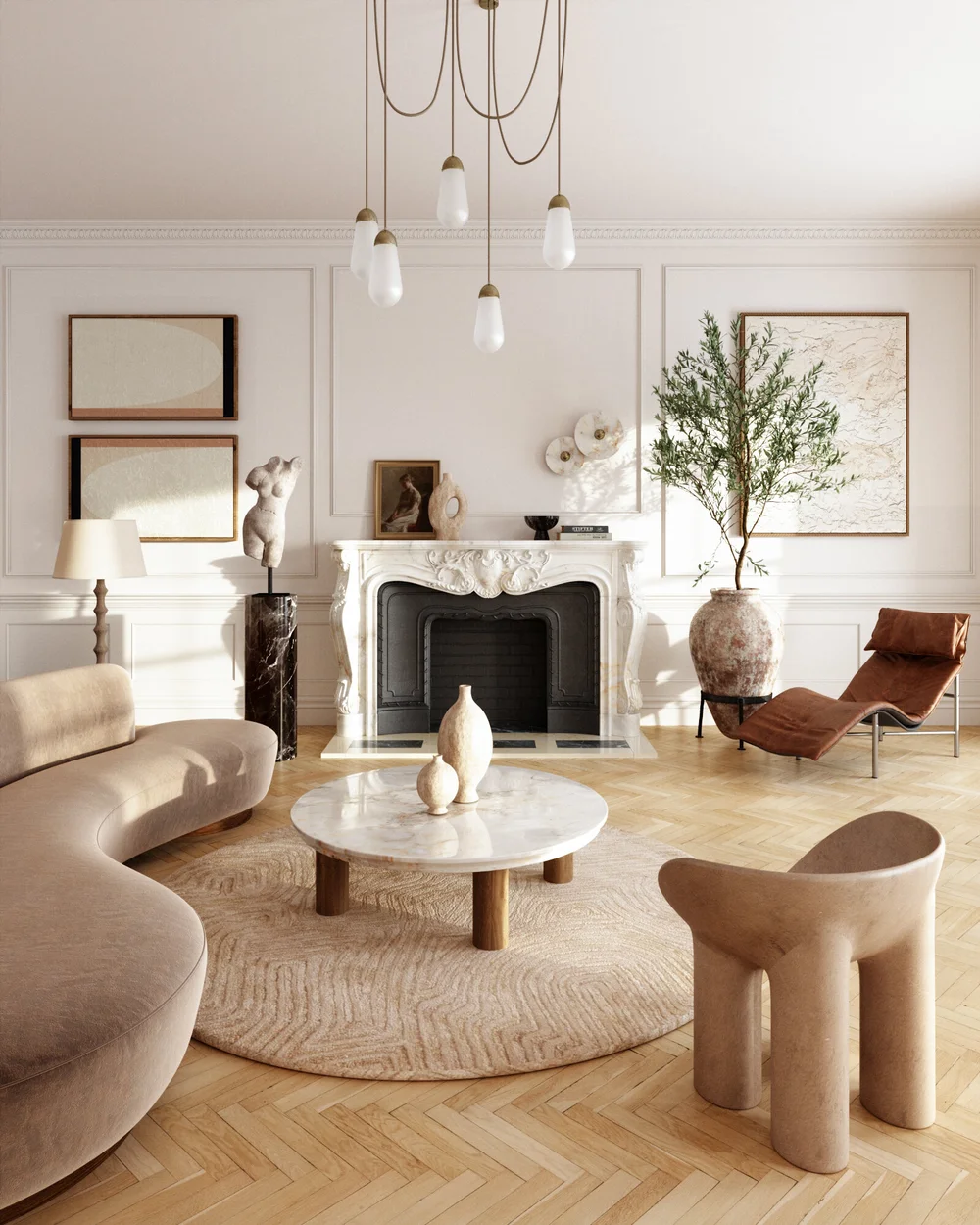
Neutral Tones
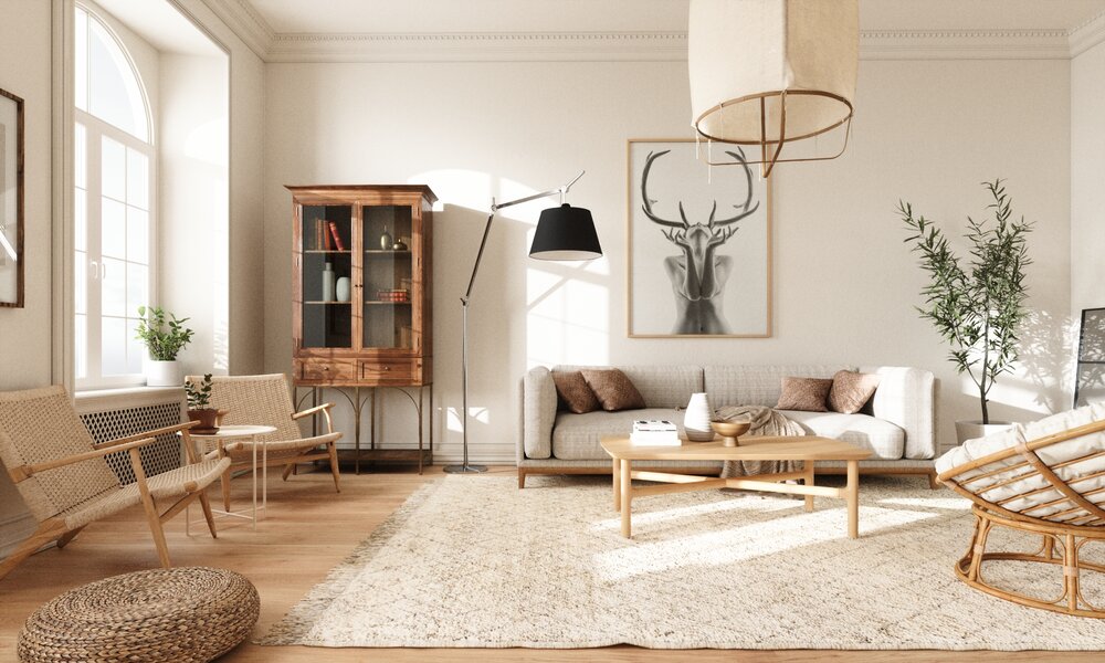
Neutrals are ideal for multi-use spaces because they offer a blank canvas for any activity, whether that be tirelessly working on a brief, chattering with friends, sitting down to eat, or preparing to fall asleep. Neutrals, defined either as organic colours or those diluted with white (like beiges, taupes, pastels, grays, and browns), fall neither on the warm nor cool side of the colour wheel, which allows them to add visual balance and support with no risk of creating discord. This function of neutrals contributes to a feeling of balance in the uses of the room as well by avoiding overstimulation and creating a space in which they can be more at peace and in control.
Soft vs. Saturated

The dominant colour chosen for a room can dictate its mood and atmosphere, but the tonality and saturation of the colour are just as important as the colour itself. For example, different shades and intensities of blue, while all cool in tone, can communicate a wide variety of emotions and intentions. Similarly, a bright, shocking yellow might stimulate and inspire the mind, making it more suitable for a home office, while a pale, pastel yellow might calm and relax, befitting a bedroom or nursery; further still, a mustard yellow might settle somewhere in between, making it the right choice for a dining or entertainment space.
When struggling to choose a color for your space, one should always rely on their instincts and personal associations with both the color itself and the color’s tone, value, and hue.